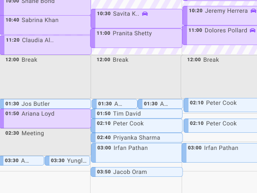
In a short span of 7 months the UX, product and development teams designed and released the first version of our patient portal application. The first iteration was focused on our internal employees for a new value based care program. The application was designed both to help our employees access better healthcare while simultaneously informing future design decisions for our ultimate goal - creating a patient portal for aging seniors that are moderately technologically savvy.
The design system was created from scratch. We were able to collaborate early in the process to ensure the developers also built matching components to keep a 1:1 consistency between our tools. The application was created so the product could be white labeled for different implementations and uses. Initially, one version of the application served up the branding elements for our internal employee program, while each component could be modified to fit the branding color and style of our outward facing application for seniors. This optimized our design and delivery time while giving a great experience to our users.
A primarily remote design team was hired for for this product, and we were able to work seamlessly from various locations, by doing frequent checkins and design reviews and collaborative tools such as Figma. We used focus groups and added remote user testing capabilities to ensure a successful product launch. We also proposed and hired an external design firm to augment our efforts and to reduce our implementation schedule further for the initial launch.
